Spring Inspired Paint Colors
- May 4
- 1 min read
When people think of color-drenched rooms, bold, saturated hues usually come to mind. But the approach doesn’t have to be heavy-handed. Softer palettes can achieve the same immersive effect, with far more longevity.
These are some great go-to hues for spring, or anytime a lighter touch is needed.
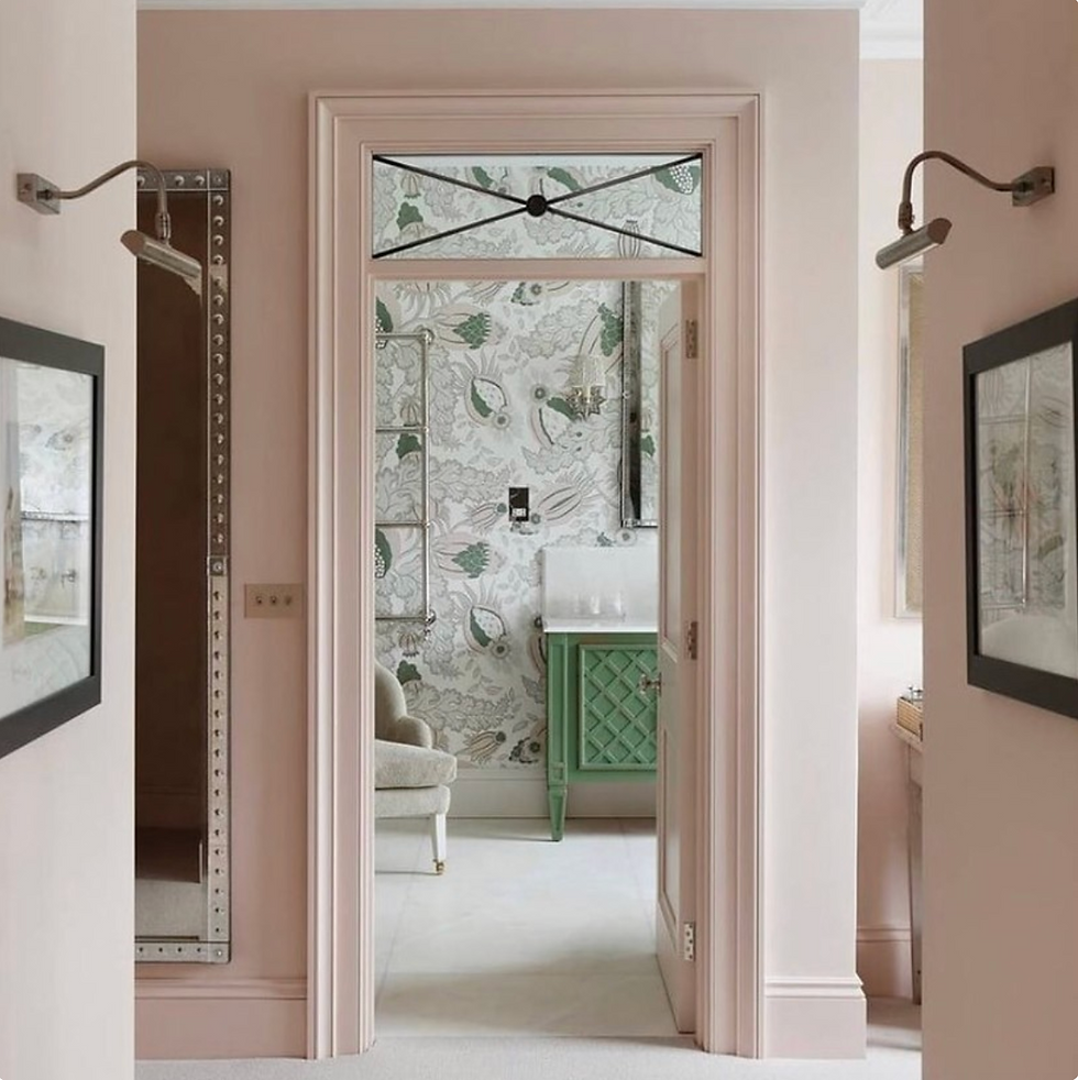
While we have seen a surge in green, there’s also been a noticeable rise in pink interiors- including kitchens, circulating through design circles. Not all of it will last. The versions worth paying attention to are the quieter ones. Less trend-driven, more nuanced. These are the shades that sit comfortably in a space rather than announcing themselves.
Our Favorite Paint Colors for Spring:
Click each hue for the paint color name!


What gives them staying power is restraint. They read as a wash of color rather than a statement, which makes them far more adaptable over time.
If you’re looking for something that feels considered without being overly styled, these soft, color-kissed hues are a strong place to start.

Want more color inspiration? Check out what some of our favorite cabinet colors are right now. Or still not on the pastel train? Our post on moody rooms might be just what you are looking for.

Lisa
Let's Make Something Beautiful


Comments