
Denmark, By Design
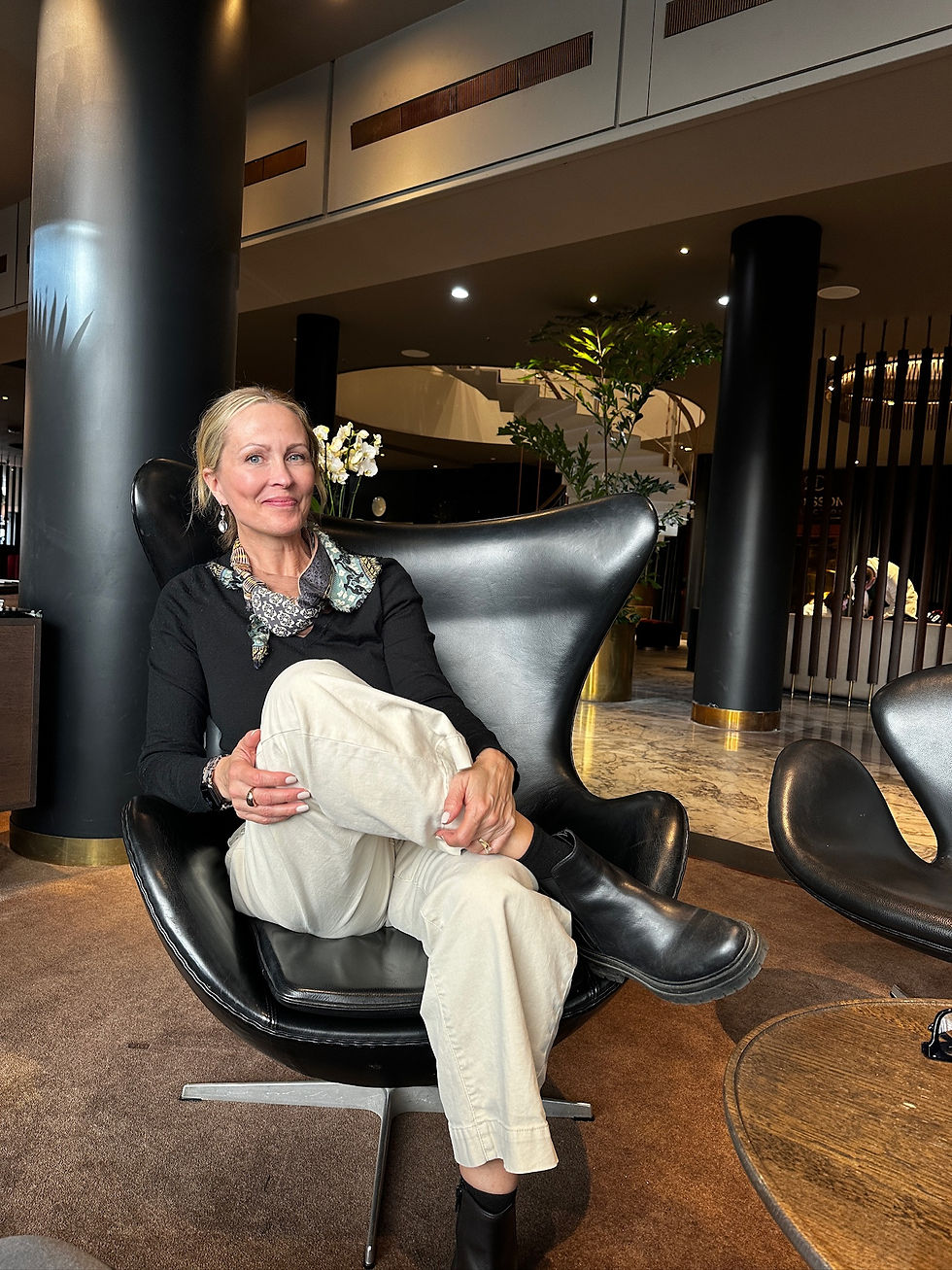
I went to Denmark expecting to notice the furniture.
And of course I did. It would be difficult not to in a country that gave us Finn Juhl, Hans Wegner, Arne Jacobsen, Poul Kjærholm, and more iconic chairs than seems reasonable for a country of its size.
But after spending time in Copenhagen, Aarhus, and Odense, it wasn't the furniture I kept thinking about.
It was the buildings.
More specifically, it was the relationship between the buildings and the place they were built in.
That's one of the things I love about travel. I may go somewhere with one idea of what I'm going to see, but inevitably something else starts repeating itself. Once my eye picks it up, I begin seeing it everywhere.
It's a little like considering buying a particular car and suddenly noticing that car all over the road. It was there the whole time. You just weren't looking for it yet.
In Denmark, it was brick. Light. Restraint. Proportion. And an extraordinary consistency between how the country looks and how it seems to function.
The Brick Isn't Just an Aesthetic
Brick is everywhere in Denmark.
Not merely as a building material, but as architecture itself.

I noticed elaborate brickwork on churches, decorative patterns worked directly into façades, and stepped gables extending above rooflines to create ornament from the material of the building itself.
Initially, I simply thought it was beautiful. But the sheer amount of brick also stood out compared with the places I've visited farther south in Europe. Then I learned why there was so much of it.
Denmark did not have an abundant supply of high-quality natural stone suitable for the monumental buildings being constructed elsewhere in Europe. When fired-brick technology arrived in the late 12th century, it offered something enormously practical: a durable building material that could be produced locally and in quantity.
Earlier buildings relied much more heavily on wood, which presented its own problems in a country where wind and fire could be a particularly destructive combination.
Brick made sense. And Danish architecture changed because of it.
Aarhus Cathedral is a wonderful example. Construction began in the late 12th century as a Romanesque church and, over the following centuries, it was expanded and transformed into the Gothic cathedral that stands today.

A cathedral of this scale built predominantly of brick is far more the exception than the rule when compared with the great medieval cathedrals farther south and west in Europe.
If you've spent time inside the great stone cathedrals of France, Italy, Spain, or England, the difference is immediately apparent.
The scale and grandeur are there. The material language is entirely different.
That distinction interests me because we tend to talk about materials as though they are primarily aesthetic decisions. Historically, they weren't.
People built with what their geography, climate, technology, and resources gave them. And some of the world's most recognizable architectural traditions came from those constraints.
Good design still works that way. The question shouldn't begin with what do I want this to look like?
It should begin with what makes sense here?
Grandeur Without Excess
The churches surprised me for another reason.
They could be enormous and imposing from the exterior, yet many of the interiors felt considerably more restrained than the churches I've visited farther south in Europe.
Most of the ones I visited were whitewashed. Architectural ribs might be painted to emphasize their form, while other surfaces were left comparatively unadorned. I saw stained glass, but proportionally far more clear or lightly colored glass than I expected.

Part of that difference is historical.
Denmark became Lutheran during the Reformation in 1536, and church interiors changed with it. The exuberance associated with later Catholic Baroque churches simply isn't the dominant Danish architectural language.
But regardless of the history behind it, the effect is interesting from a design standpoint.
The architecture does much of the work. Proportion. Height. Repetition. Material. Light.
You don't need to cover every surface with decoration to create impact. Restraint is not the absence of design.
Done well, restraint requires an enormous amount of it.

And Then There Is the Light
If brick was the material I noticed most, natural light was the element I saw used most consistently—including in the churches.
And not only in beautiful homes or museums. Everywhere.
The airport. Libraries. Hospitals. Public buildings. Historic buildings. Contemporary ones.
Windows were generous. Views extended outdoors. Buildings seemed unusually conscious of where daylight came from and how far it could travel once it entered.
That makes perfect sense when you consider the climate. For a substantial portion of the year, Denmark has short days, long periods of darkness outside working and school hours, and plenty of cold, gray weather.
When something is limited, you pay more attention to how you use it.
That relationship between climate and architecture was one of the things I found most interesting about Denmark—and one I ended up exploring much further after I came home.
More on that in a minute.
Finn Juhl and the Problem With "Minimal"
One place where many of these ideas came together was Finn Juhl's home outside Copenhagen. The house was completed in 1942 and is surprisingly modest considering Juhl's enormous influence on mid-20th-century furniture design.
My boys thought it felt cold and stark. I understood why. But I saw something different.

The architecture itself is restrained, but the house is hardly devoid of personality. Juhl used wood, artwork, sculptural furniture, upholstery, painted surfaces, and carefully considered color throughout it.
The color was particularly interesting. The walls were predominantly white, but every ceiling carried a different—and, I was told, very deliberate—color. Painting a ceiling isn't particularly revolutionary to us today, but seeing that kind of considered color placement in a house completed in 1942 gave it an entirely different context.

And then there are the windows. Most were generously sized, particularly in the living areas. They establish relationships between the rooms and garden, frame specific views, and allow the landscape to become part of the interior.
The house is simple, especially from the outside. But simple and simplistic are very different things.
There are a tremendous number of decisions inside something that initially appears effortless.
And perhaps the best evidence is that no single element screamed for attention.
The furniture is extraordinary. The artwork matters. The color matters. The architecture matters. But nothing feels as though it is competing to be the star.
It works as a cohesive whole.
Which, of course, is exactly what you would expect from one of the heavy hitters of mid-century design.
A Culture of Proportion

The longer I was there, the harder it became not to notice a parallel between Danish design and Danish life.
This is admittedly an observation based on a few weeks, not an anthropological study.
But the Danes I encountered seemed to have a remarkable sense of proportion about things.
Work matters. But apparently so does leaving it.
Home matters.
Social life matters.
Community matters.
Rules matter.
There seemed to be a formality and reserve to people at first, but every interaction I had was kind. And beneath that reserve was a society that appeared to be quite deliberate about making room for life outside of work. I kept thinking about the design principle of balance.

Balance does not mean that everything is equal. It means that the individual parts exist in a relationship that makes the whole work.
Perhaps I'm reading too much architecture into human behavior. Occupational hazard. But Denmark left me thinking about both in much the same way. There is grandeur, but also restraint. Beauty, but tremendous practicality. Individuality within a strong collective framework.
Old buildings beside very contemporary ones.
And design that rarely seems interested in shouting for attention.
Design That Belongs Where It Is
The lesson from Danish design is not that the rest of us should make our homes look Danish.
It's understanding the principles behind it and interpreting them in a way that makes sense for our own homes.
Because the most interesting thing about Danish design may be how specifically Danish it is.
Its architecture developed in response to available materials, northern light, climate, religion, craftsmanship, and the ways people actually lived. Limited resources mattered. Months of short days, cold weather, and dark skies mattered. The materials available locally mattered. The culture mattered.

Those constraints didn't diminish the design. They created its character.
That is a far more useful lesson than importing another pale oak chair and calling it Scandinavian. A successful home should have the same sense of belonging.
It should respond to its architecture, geography, light, surroundings, and, most importantly, the people who live there. Because the best design doesn't simply look good. It makes sense where it is.
Want the Designer's-Eye Version?

One aspect of Danish design I couldn't stop thinking about after I returned home was the way they use natural light.
I went considerably deeper into that in the latest edition of The Curated Edit—including what Finn Juhl's home, an enormous public library in Aarhus, and even a conversation with a Dane about seasonal depression revealed about designing around the light you actually have.
And because The Curated Edit isn't all design all the time, I also included a few decidedly less architectural discoveries involving hot dogs, clubs, and a losing battle between my hair and the Danish wind.

Lisa
Let's Make Something Beautiful


